BiltOn Risk Intelligence Dashboard
A self-initiated concept: an end-to-end, AI-orchestrated product design and build, proposed as an improvement to a live construction-tech platform
What this is
This project was not commissioned. It was built for two reasons: to demonstrate an end-to-end capability: research, UX, UI, engineering, accessibility and security, carried out as one continuous process, and to put forward a concrete, working proposal for how BiltOn’s Risk Intelligence surface could be sharpened.
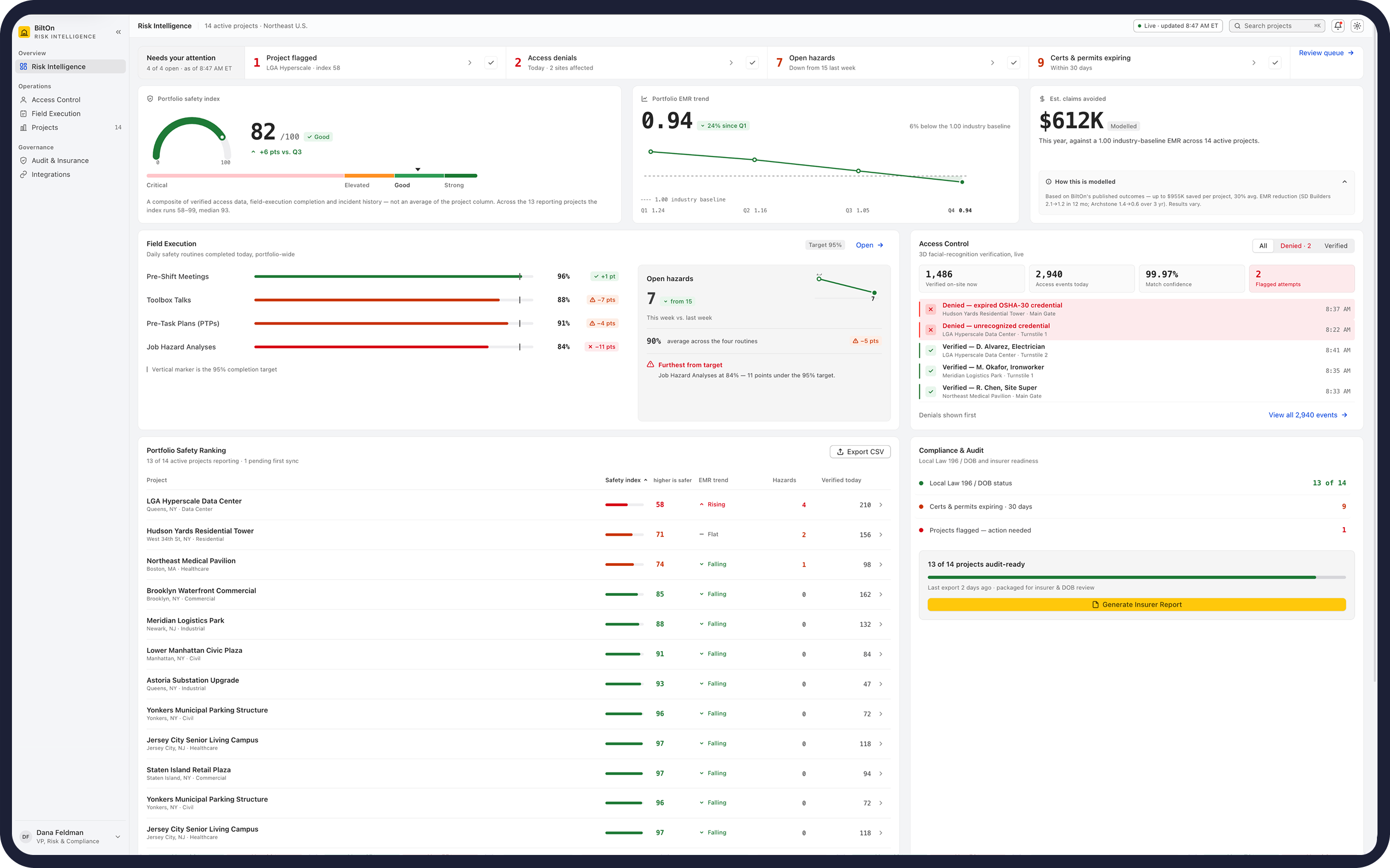
It is a functioning application, not a mockup. Six routes, a real component library, a three-layer design-token system covering light and dark, 457 automated tests, and a measured accessibility pass. Every figure it displays comes from a documented demonstration dataset modelled on what BiltOn’s own platform collects. Nothing is invented to make a screen look good – a constraint that turned out to shape the entire design.
It is offered in the spirit of a strong proposal: here is the problem as I understand it, here is a build that answers it, and here is the reasoning, including the parts that did not survive scrutiny.
The business, and what the dashboard does
BiltOn is a platform that turns worker and site data into decisions: credentials and orientations, digital turnstiles and access-control hardware, 3D facial-recognition verification, real-time headcount, daily safety routines, field observations and compliance records – integrated with Procore and Autodesk.
The commercially decisive insight, and the one that drove every layout decision, is this: the buyer is a risk function, not a project manager, and the argument is insurance.Safety performance converts into Experience Modification Rate, and EMR converts into premium. A dashboard for this audience is not a reporting screen; it is an instrument for defending numbers to an underwriter or a regulator.
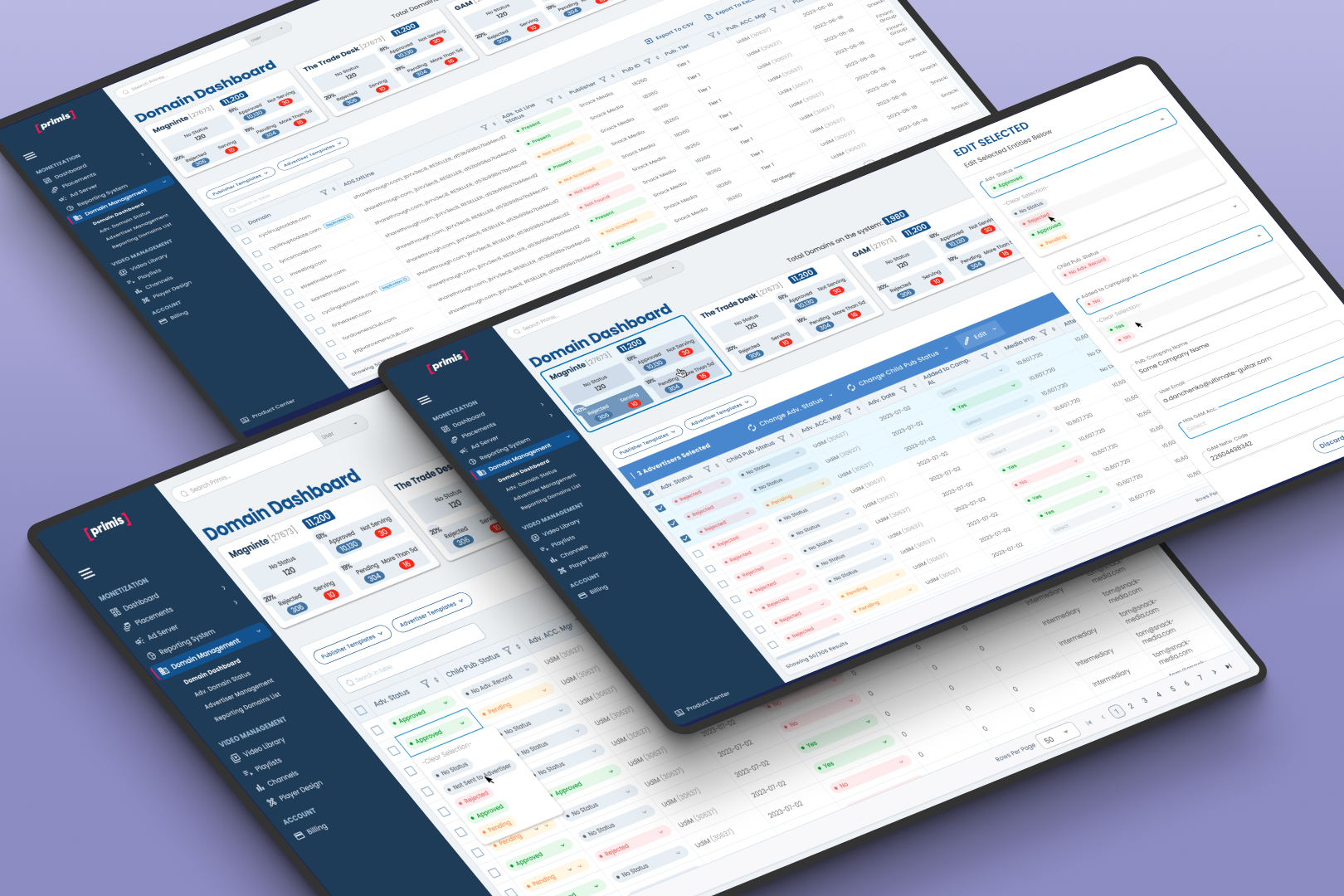
The dashboard answers four questions on one screen:
- What needs a decision today. A triage strip opens the page – flagged projects, access denials, open hazards, expiring certificates. Each item carries its own filter into the view that holds the work, so a click lands on the problem rather than near it. Items can be acknowledged without being hidden.
- How the portfolio is performing. A composite safety index, and an EMR trend read against the 1.0 industry baseline, because a score without a comparator is unusable.
- Who is on site, and who was refused. Live access verification, with denials sorted to the top regardless of when they occurred. A refused entry is the only thing on the screen that needs acting on this hour.
- Whether the evidence will hold. Local Law 196 / DOB and insurer readiness, packaged into an export an inspector or underwriter will accept.
Underneath sits a deliberate stance on honesty. Two figures in the dataset do not reconcile – a composite index against the mean of its column, and a headcount against the sum of its projects. Rather than quietly averaging the difference away, the interface states both numbers, explains the gap (one project has never synced), and locks the explanation with tests. The same rule removed a “Method: 3D facial recognition” field that had been asserted on every access event, including refusals where no facial match ever occurred. On a screen used as claim evidence, one unsupported field discredits every honest figure beside it.
Research and findings
Desk research covered BiltOn’s own positioning and platform, its named customers, and its competitive set – HammerTech (the closest head-on competitor, matching it almost feature-for-feature including access control and AI insight), Eyrus (closest on the hardware-plus-credentials model, and notable for surfacing denied-access attempts as a headline metric), and SafetyCulture/Mitti (the horizontal incumbent – far larger, but not construction-specific and not insurance-oriented).
Three personas were constructed, their roles grounded in the category’s own audience segmentation:
- The Corporate Safety Director – the daily user, compensated on incident rate and EMR. Abandons a tool when a score carries no direction or threshold, or when two views disagree and they get caught out in a meeting.
- The Risk and Claims Manager – adversarial by training, and the reason the product exists commercially. Needs provenance for every figure: source, period, method. One unsourced savings number discredits the screen.
- The Compliance Executive – a burst user around audits and expiries. Abandons when a tool implies coverage it does not have. Silent partial data is worse than no data, because it produces a confidently wrong filing.
From these, the operating norms: provenance and as-of are mandatory, not polish; absent data is modelled, never imputed; aggregates must visibly reconcile with their details; exceptions outrank volume; and status is never carried by colour alone.
Two findings are stated as limits rather than results, because that is what they are. BiltOn’s published outcome statistics render as animated counters and could not be read, so they are not quoted here. And the EMR case-study figures the concept references cite genuine BiltOn customers, but those specific numbers could not be verified against a primary source. They are labelled as such in the build. A case study that hides its unverified inputs is not a case study.
Agentic Method
The work was carried out by six specialist agents working in sequence toward a single goal – the most defensible dashboard for this specific business – each receiving the full output of everyone before it.
Researcher established the market, the competitive set and the personas. UX Reviewer walked every view and dialog against those personas. UI Designer audited the visual system, computing WCAG contrast ratios from actual colour values rather than estimating them. Frontend Engineer reviewed correctness, type safety, state architecture, and critically, the quality of the test suite itself. Security Reviewer assessed the PII surface, export integrity and the client-storage model. Team Lead adjudicated everything.
Sequence, not parallelism, was the point: each agent could confirm or contradict the ones before it, and they did. The engineer corrected the UX reviewer’s diagnosis on a compliance meter – right conclusion, wrong line, and narrowed an overstated finding. The security reviewer, explicitly instructed not to inflate severity for a backend that does not exist, returned zero critical findings and said so plainly rather than manufacturing one. The Team Lead consolidated 95 raw findings to 73 and declined to sustain seven, including two claimed crash bugs that turned out to be unreachable, publishing its reasoning in a “not upheld” section.
The method’s own limits were recorded alongside its results: no agent ran a browser, a build or the test suite, so every claim about behaviour was verified separately afterward, which is how several findings were reduced from severe to latent, and how the team discovered that four of the highest-severity issues lived in exactly the places the existing tests were structurally unable to reach.
What this produces is not a faster designer. It is an adversarial one, a process where the reviewer’s job is to disagree with the designer, the engineer’s job is to disagree with the reviewer, and the lead’s job is to throw out whatever does not survive.
The design direction: an Apple pro-app register, and where it had to be broken
The brief was a high-end, professional feel. The reference chosen was Apple’s Human Interface Guidelines – specifically the macOS pro-app register of Finder, Xcode and Mail, not the marketing aesthetic of apple.com. A safety director scanning fourteen projects before 9am needs the dense instrument panel Apple builds for people who live inside a screen, where information density beats polish wherever the two conflict.
The system was locked before any screen was drawn
The visual layer was produced under Hallmark, an opinionated design skill whose stated purpose is to make generated interfaces look made, not generated. It works by forcing commitments up front: a macrostructure (a complete page-shape), a genre, navigation and component archetypes, then stamping them into the stylesheet so later sessions inherit those decisions instead of re-litigating them.
Three of those decisions carried the direction. Workbench: source-list rail, unified toolbar, grouped content boxes – is how a professional desktop application is organised, which made the Apple reference structural rather than a skin. A custom theme instead of one of Hallmark’s twenty-one presets, because the brief named a brand colour to anchor on (BiltOn gold, used for identity and never for status) alongside a vibe no preset could carry. Enrichment: none – the skill forbids decoration on application screens outright. Function carries the screen.
Hallmark also enforces one rule that outgrew the visual layer entirely: if a metric was not supplied, it may not be invented. That is why this dashboard shows two figures that do not reconcile and explains the gap rather than averaging it away, and why a plausible-looking “Method: 3D facial recognition” field was deleted from the access drawer instead of left in place. A design constraint became a product principle. The system file the skill writes design.mdthen holds the direction across sessions: on a project it governs, its usual push for variety inverts – consistency becomes the goal, and drift is treated as a defect
View Live Project Online >