BiltOn Permit-to-Work - Foreman App
An End-To-End AI-Powered Product Design & Development for a Work Permit Request App in the Construction-Tech Business
BiltOn Foreman – Permit-to-Work, Rebuilt for the Job Site, Not the Office.
Mobile-first safety compliance · single-page app · 2026
Project Overview
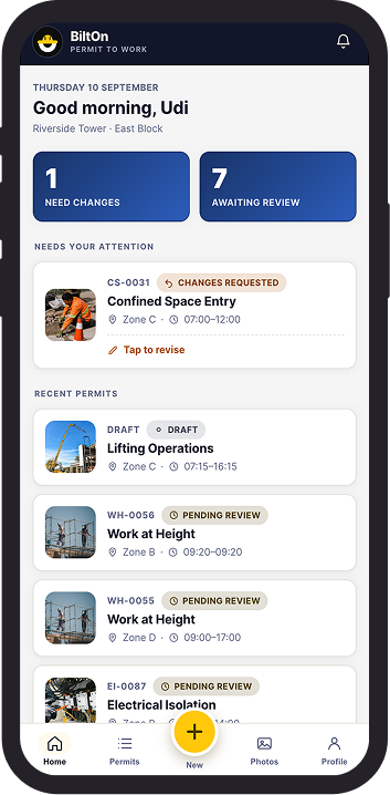
Most permit-to-work software is designed for the person reviewing a permit at a desk – not the foreman raising one on-site, one-handed, in gloves, with a signal that comes and goes. BiltOn Foreman inverts that: every screen is built around the constraints of the field first.
The problem:
A permit-to-work system exists to stop unsafe work before it starts – gas testing before confined-space entry, isolation verification before electrical work, rescue plans before work at height. But most digital PTW tools bury that logic under generic form UI, and treat a foreman’s context – outdoors, time-pressured, often on one device shared across a crew – as an edge case rather than the primary one.
The approach:
BiltOn Foreman is a schema-driven permit engine: each of ten permit types (Hot Work, Confined Space Entry, Work at Height, Electrical Isolation, Excavation, and five others) carries its own safety checklist, with fields flagged as required, critical, or submission-blocking independently – so a gas-test result marked “unsafe” can hard-block a permit the same way a missing rescue-plan confirmation does. Photo evidence is captured through an in-app camera with tap-to-annotate pins, not a bolted-on file picker. Date and time entry uses a custom wheel picker rather than native inputs, tuned for thumb reach on a phone. The whole thing runs as a single, self-contained HTML file – no backend, no build step – persisting to local storage so it keeps working when connectivity doesn’t.
The discipline:
Every interactive element holds to a 44px minimum touch target for gloved use. Destructive actions – discarding a draft, reverting a revision – go through explicit confirmation rather than a silent timeout, because on a safety-critical form, “trust me, it’s saved” isn’t good enough as a design pattern.
How it was created:
Rather than a single pass of self-review, the app went through a five-role pipeline – Researcher, Designer, Developer, QA, and a Team Lead – each handed the work in sequence and building directly on what came before: the Researcher’s findings became the Designer’s brief, the Designer’s spec became the Developer’s implementation, and QA verified the result against the original findings, not just against the code. The Team Lead’s job wasn’t to sign off – it was to push back: independently re-checking the Researcher’s claims against the actual code, re-deriving the Designer’s numbers by hand, and spot-verifying the Developer’s fixes before accepting them. That process caught two real issues before they shipped: a Close button that claimed to save a draft but silently discarded it, and six safety-critical checklist items – ventilation, rescue plans, isolation verification among them – that could previously be skipped entirely at submission.
It’s a small example of the principle behind his work: the goal isn’t to make a complex process feel simple by hiding its complexity – it’s to structure that complexity so the person doing the job can move through it fast, without the system ever letting them move past something that matters.
View Live Project Online >