Primis: Ad-Tech Platform – Role Based UI Layouts & Dashboards
Company
Primis Video Discovery
Product
A Video Ad-Tech Configurations Platform
Feature
Role-Based Layouts & Menus. Global & Publisher Dashboards
Year
2025
About Primis
About the Product
Primis is an Ad-Tech Video Discovery and Monetization Company. Primis platform helps publishers increase revenue by enabling users to discover high-quality video content, maximizing video monetization opportunities
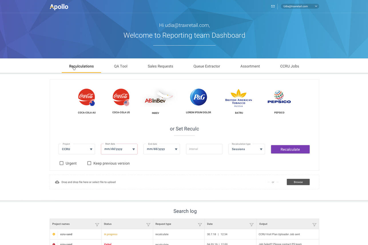
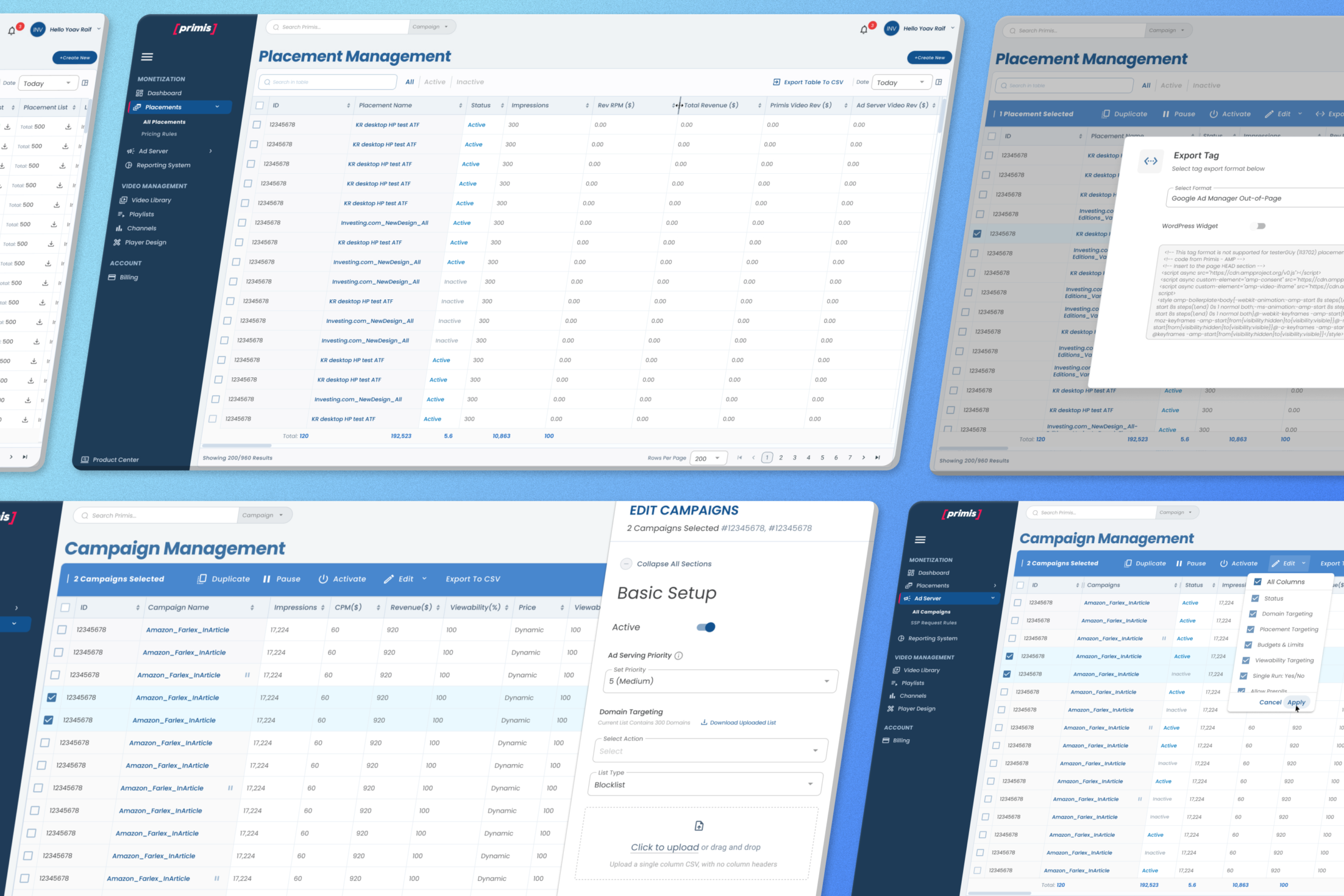
An Ad-Tech Configurations & Management Platform The Video Ad-Tech Configurations and Management Platform provides a complete environment for video campaigns and placements management with advanced configurations, CRUD-based options, and publisher integrations. It combines advanced configuration tools with real-time data visibility across the system’s dashboards – enabling full operational control from a single platform.
The Feature
Challenges
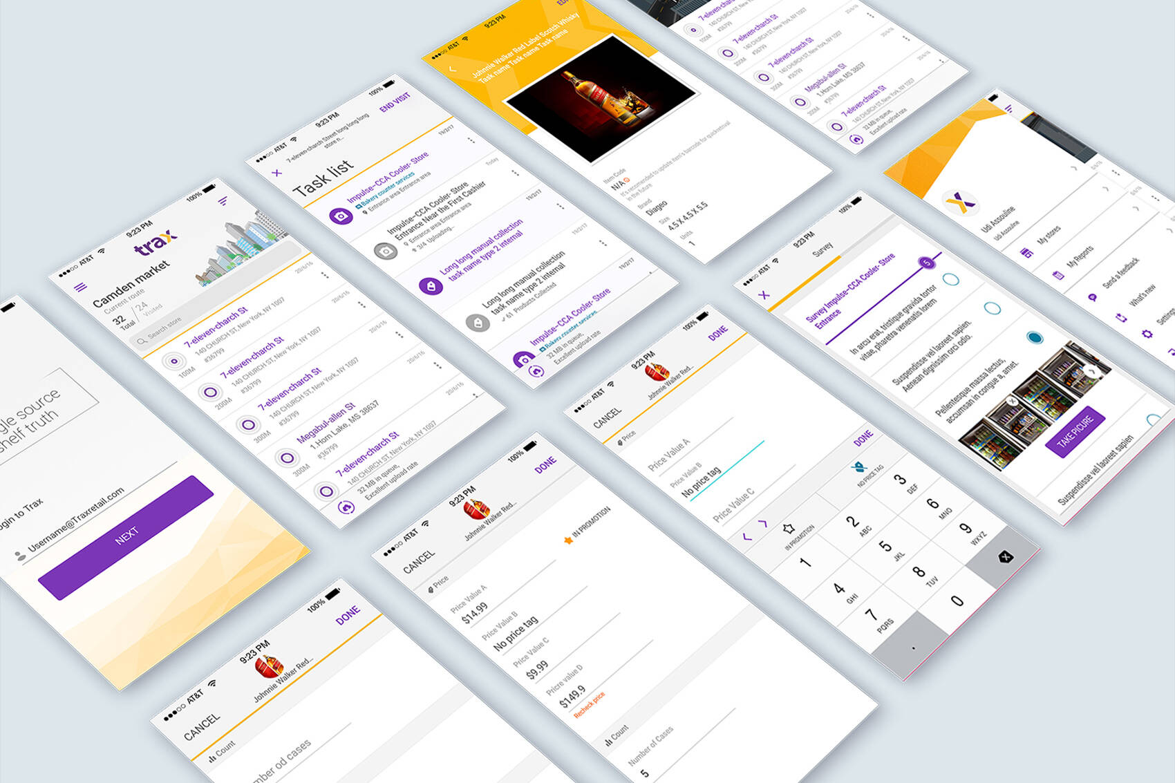
Role-based layouts and navigation structures driven by the platform’s permission model, supporting six distinct user roles. Each role is presented with a tailored interface that dynamically controls data visibility, available actions, and configuration options according to its permissions, ensuring clarity, security, and operational efficiency across the platform
The existing Configurations and Management Platform is outdated, yet it contains years of accumulated knowledge and patch-based features built with little to no documentation. As the business has evolved significantly over the past decade, most features required a fresh evaluation to ensure they align with current needs. Each capability needed to be reassessed and modernized to meet today’s operational requirements.
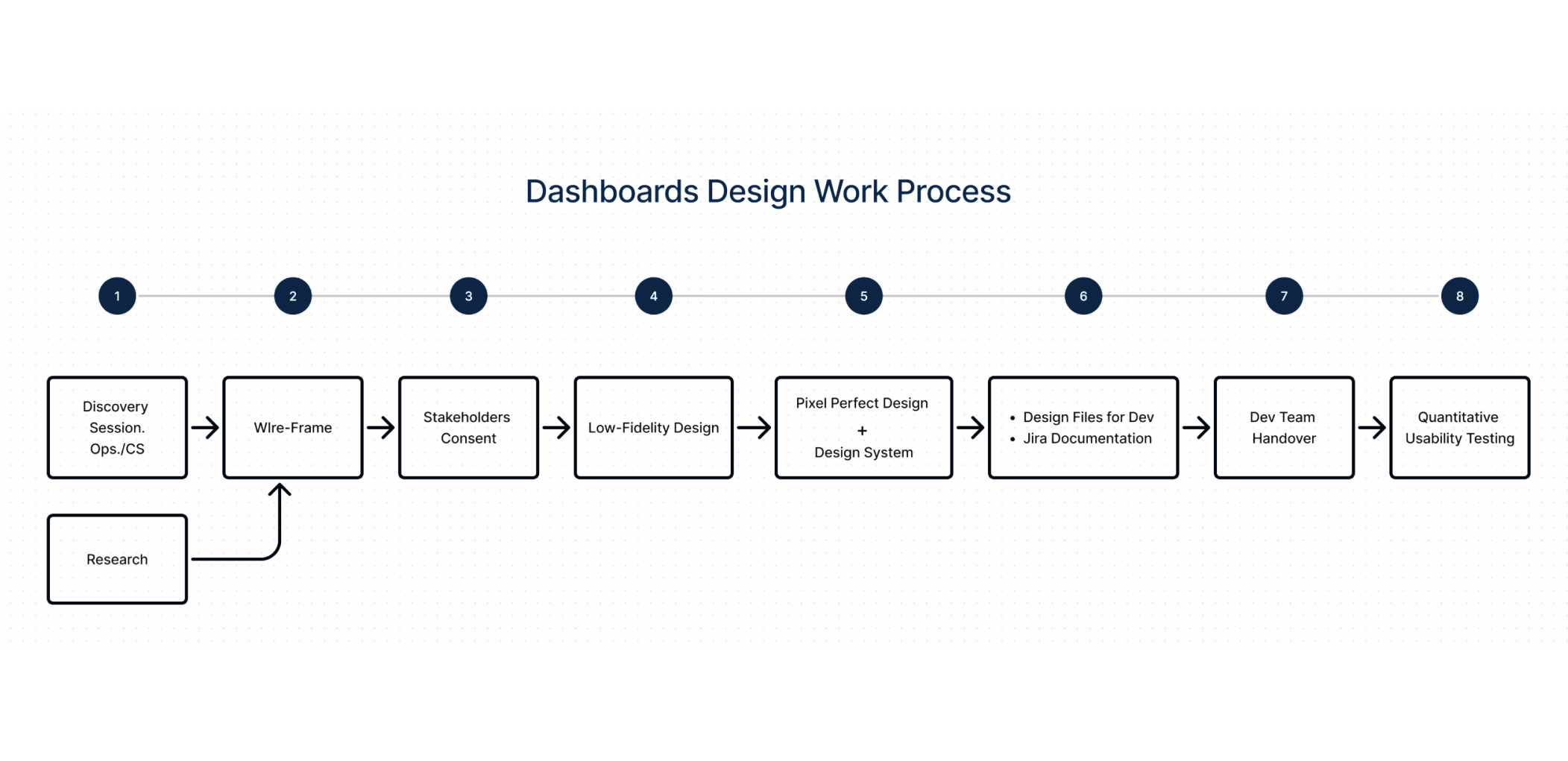
My Role in this Project
⸺ Qualitative Research ⸺
Gathered user insights to drive evidence-based design.
⸺ Sketch Visualization ⸺
Defined the visual direction.
⸺ Rapid Prototyping ⸺
Validated ideas through testing.
⸺ Product Packaging ⸺
Crafted the unboxing experience.
⸺ Development Handoff ⸺
Ensured technical feasibility.
⸺ Usability Testing ⸺
Identified friction points through direct user feedback.
User-Role UI Layouts – Vision, Ideation & Creation
Research
User research & stakeholder alignment
Conducted interviews with 8 operational users across global ops, publishers, syndicators, and advertiser teams to map pain points linked to platform complexity.
Identified workflows that span multiple roles, e.g., publisher dashboards vs advertiser data.
Mapped feature conflicts where global controls conflict with the User Role attributes.
Competitive & ecosystem analysis
Audited 6 industry ad‑tech consoles (PubMatic UI, Magnite, Google Ad Manager, Open X, Connatix, and Teads) to catalogue navigation patterns for multi‑role environments.
Benchmarked role‑aware navigation systems (e.g., AWS IAM console, Zendesk support roles) to find proven patterns for progressive disclosure of controls.
Insights
Users with multiple roles consistently re‑entered search terms and toggled filters due to poor contextual state.
Switches between roles were clumsy and led to lost context or misapplied configurations.
Solution
This research shaped the decision to build tailored navigation, role‑aware data surfaces and impersonation modes that preserve context across transitions.
I partnered with the Dev Team to evolve the platform’s permission model and created an upgraded user roles management system to display 6 user roles instead of 2, with tailored views and a distinct UI for each role. On top of that, each Admin and A. Manager user role can log in as a publisher or Advertiser and impersonate them to see their view and take actions in a managed service mode.
As for the main navigation left panel, I created an expandable and collapsible side navigation with sub-links and left space for additional core navigation links on the menu for future development, in case they are needed.
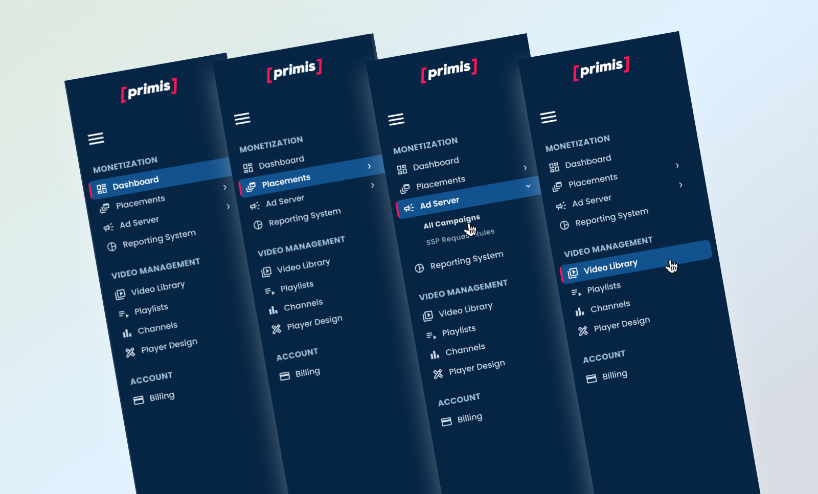
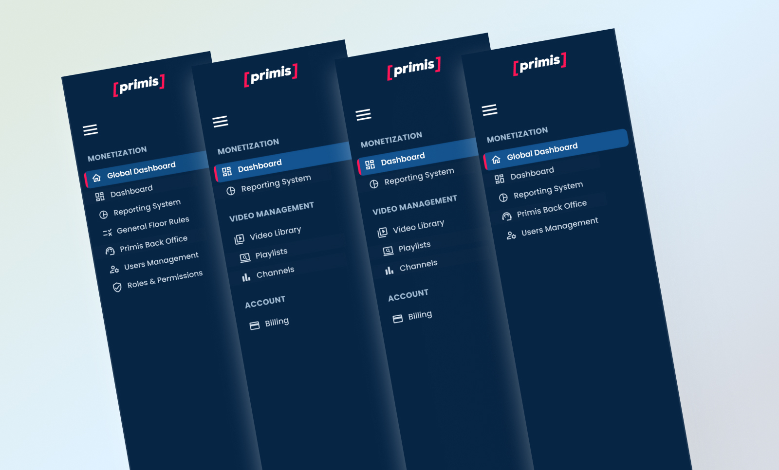
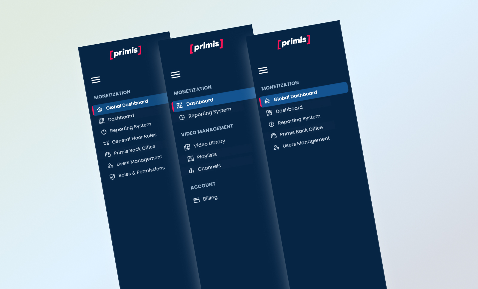
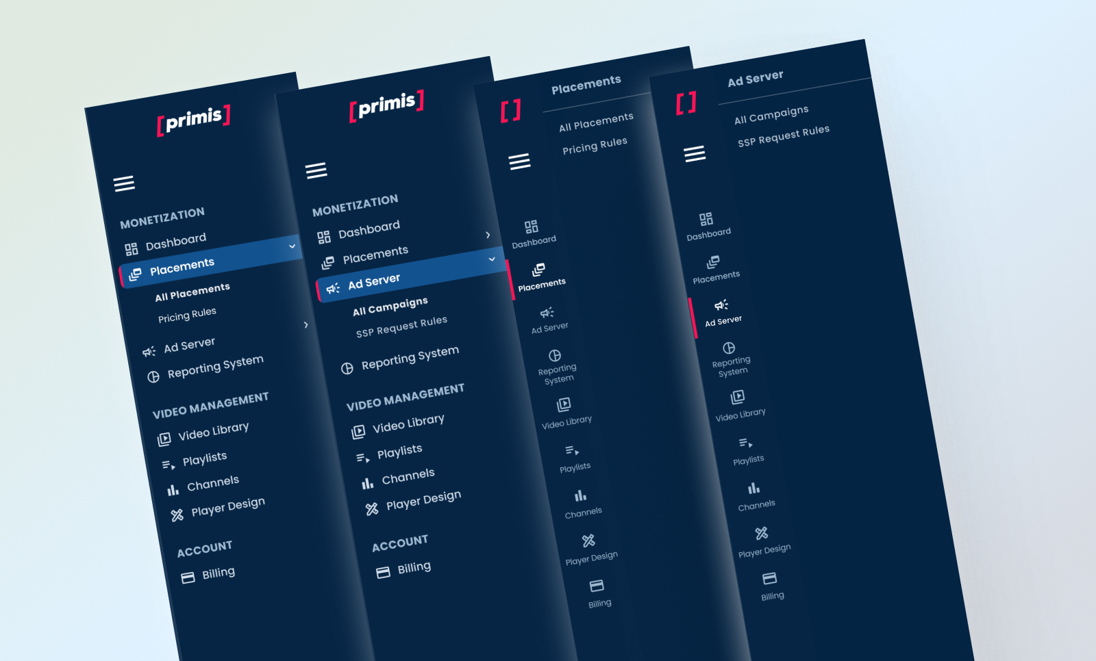
Various User-Roles UI Layouts
Colors & Graphic Language
Before getting to the dashboard’s design, I lacked a range of colors to create a rich dashboard environment. Graphically, Primis’s core color palette was basic, with 4 fundamental colors and no range of hues. It lacked branding guidelines, symbols, and iconography. To enrich that, I took the main Primis colors, expanded them into a broader palette, and used them for the dashboards and the platform theme UI elements. For the iconography, I used relevant MUI icons and packed them in the platform’s theme.
Primis Pink 500 #FF1455
Primis Pink 400 #FF5B88
Primis Pink 300 #FF89AA
Primis Pink 200 #FFB8CC
Primis Navy Blue
Primis Navy Blue Alpha 1
Primis Navy Blue Alpha 2
Primis Navy Blue Alpha 3
Primis Royal Blue .
Primis Royal Blue Alpha 1
Primis Royal Blue Alpha 2
Primis Royal Blue Alpha 3
Amber Yellow #FF6F00
Amber Yellow Alpha 1
Amber Yellow Alpha 2
Amber Yellow Alpha 3
Green #22543D
Green Alpha 1
Green Alpha 2
Green Alpha 3
Alerts: Red – #F62A1B
Alerts: Yellow – #FF8F00
Alerts: Cyan – #00ACC1
Alerts: Teal – #009688
Global Dashboard – Vision, Ideation & Creation
Research
1) Stakeholder & Business Interviews
Interviewed 8 internal users across Ops, Product, Support, and Analytics to define not only what metrics they want, but why a central dashboard matters to them.
Clarified business outcomes: reduce time to insight, increase operational efficiency, and unify KPIs across modules in one consistent interface.
Mapped internal strategic goals (revenue growth, publisher retention, error reduction) to measurable dashboard outputs.
2) Competitive & Ecosystem Benchmarking
Audited 8 dashboards in ad‑tech and data ops tools (SSPs, BI tools, monetization platforms) to identify common data patterns and layout conventions that support fast insight extraction.
Measured how leading products handle filtering, cross‑module navigation, and multiple data slices (e.g., periods, role‑scoped KPIs).
3) Cognitive & Workflow Mapping
Ran task analysis sessions where users completed core tasks (find revenue trend, change period, compare publisher vs global) using the legacy interface.
Identified key pain points: context loss when navigating between modules, unclear period selectors, and ambiguous KPI definitions.
Core insights
Users need control of context (periods, slices, role scope) before they need detail.
Dashboard adoption rises when navigation and search are predictable and persistent.
Visual hierarchy must match decision urgency (what’s most important now) vs exploration (drill‑downs).
What this research informed
Use of a universal time selector with presets + custom range, placed persistently in the top bar.
Centralized global search that returns results across entities (publishers, campaigns, placements).
Data hierarchy and visuals that reflect high‑level KPIs first, drill‑down second.
Solution
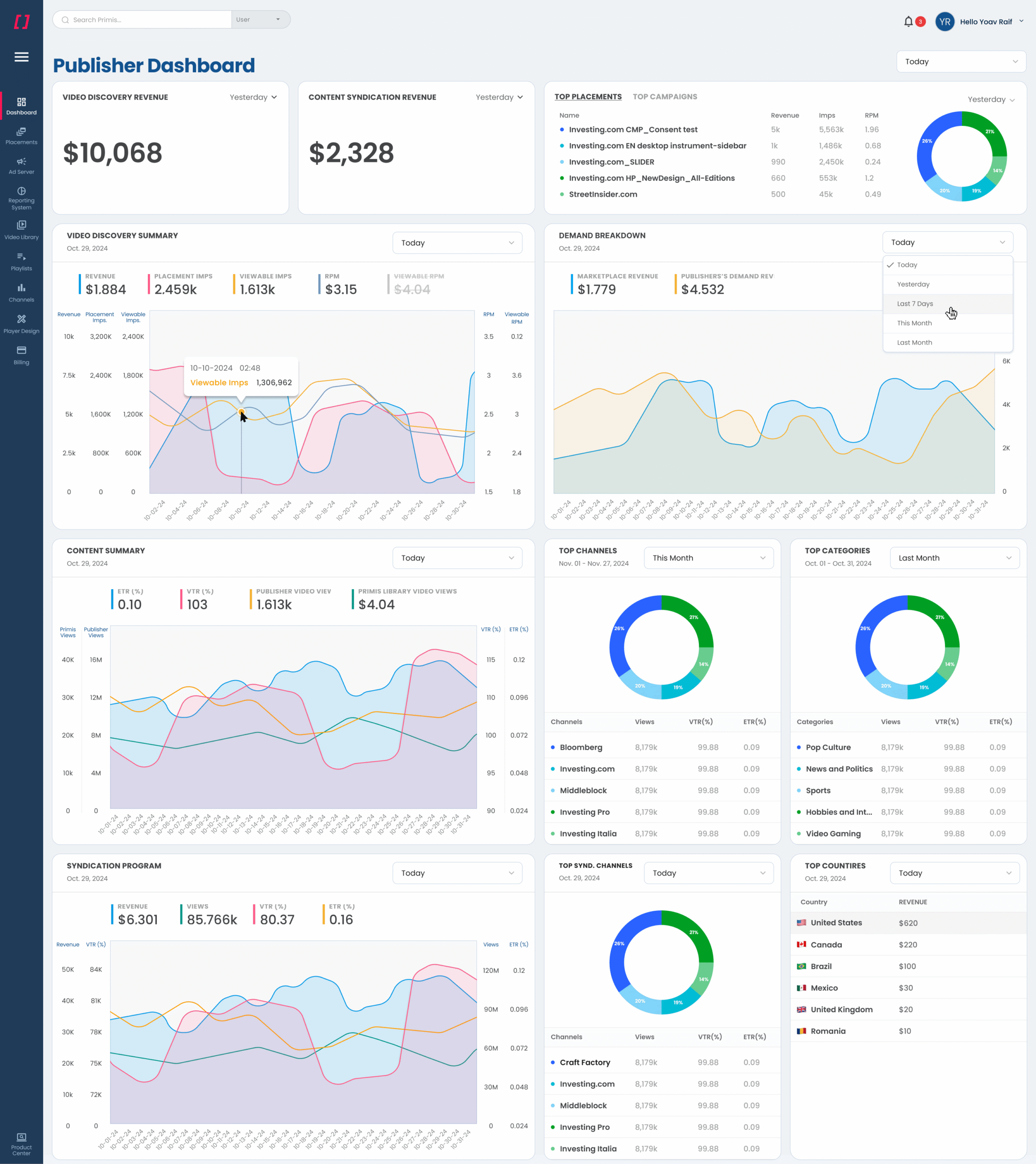
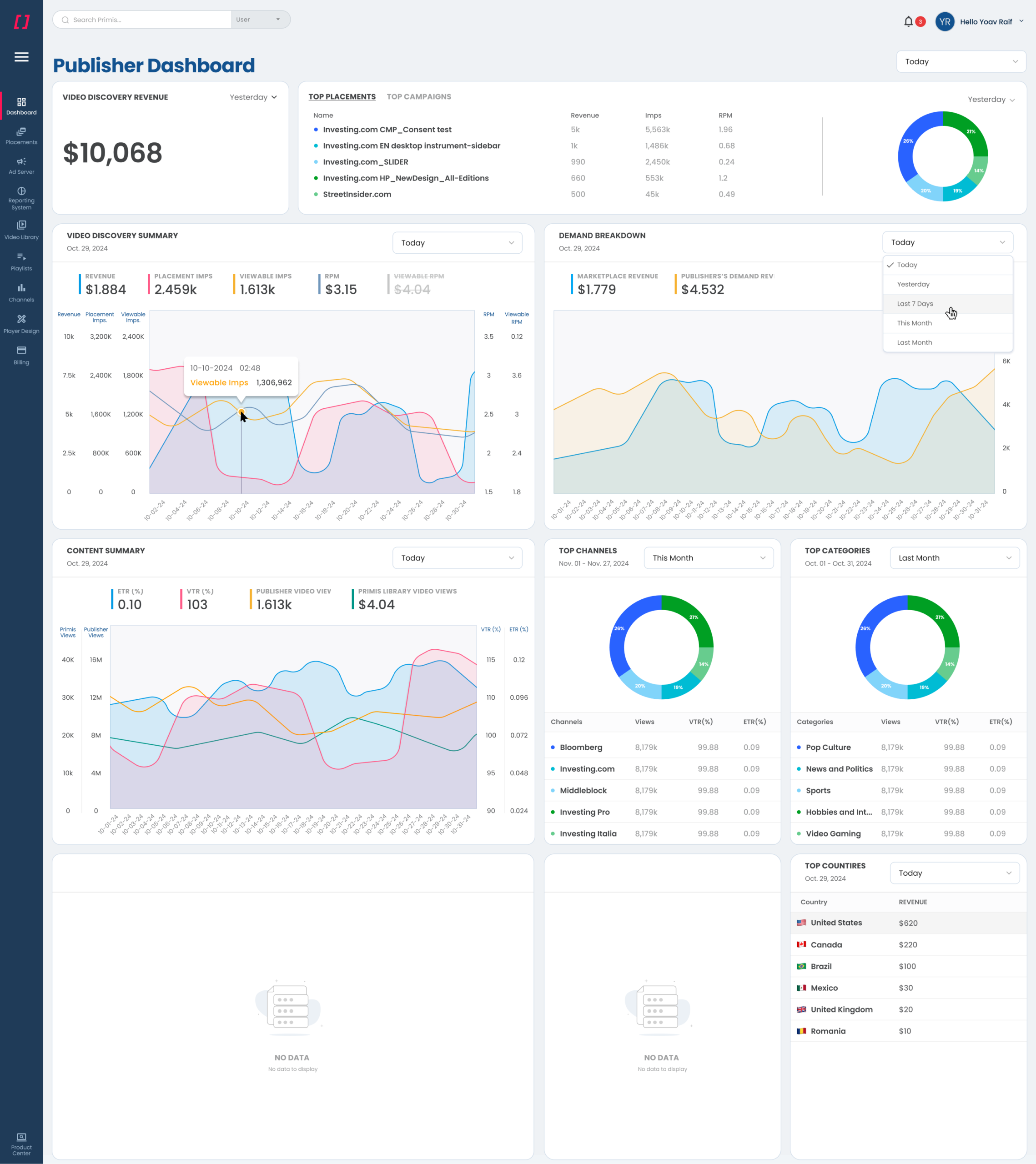
I designed the Global Dashboard as the central entry point for the entire platform, bringing navigation, system-wide tools, and high-level data into a single, structured workspace. I added the option to select a specific time frame, plus the option to customize it (Last day, 3 days, week, month, customized). The layout provides immediate access to all core modules through a collapsible left navigation, paired with a global search bar that enables users to jump directly to campaigns, publishers, placements, or system tools. Visually, I used the extended UI palette in the dashboard layer, using Primis colors, iconography, and layout patterns to create a new and refined look & feel across all dashboards. The dashboard gives users a clear overview of key operations, frequent actions, and system activity, supporting fast orientation, seamless movement across the platform, and efficient handling of large-scale workflows.
Ideation Wire-Frame
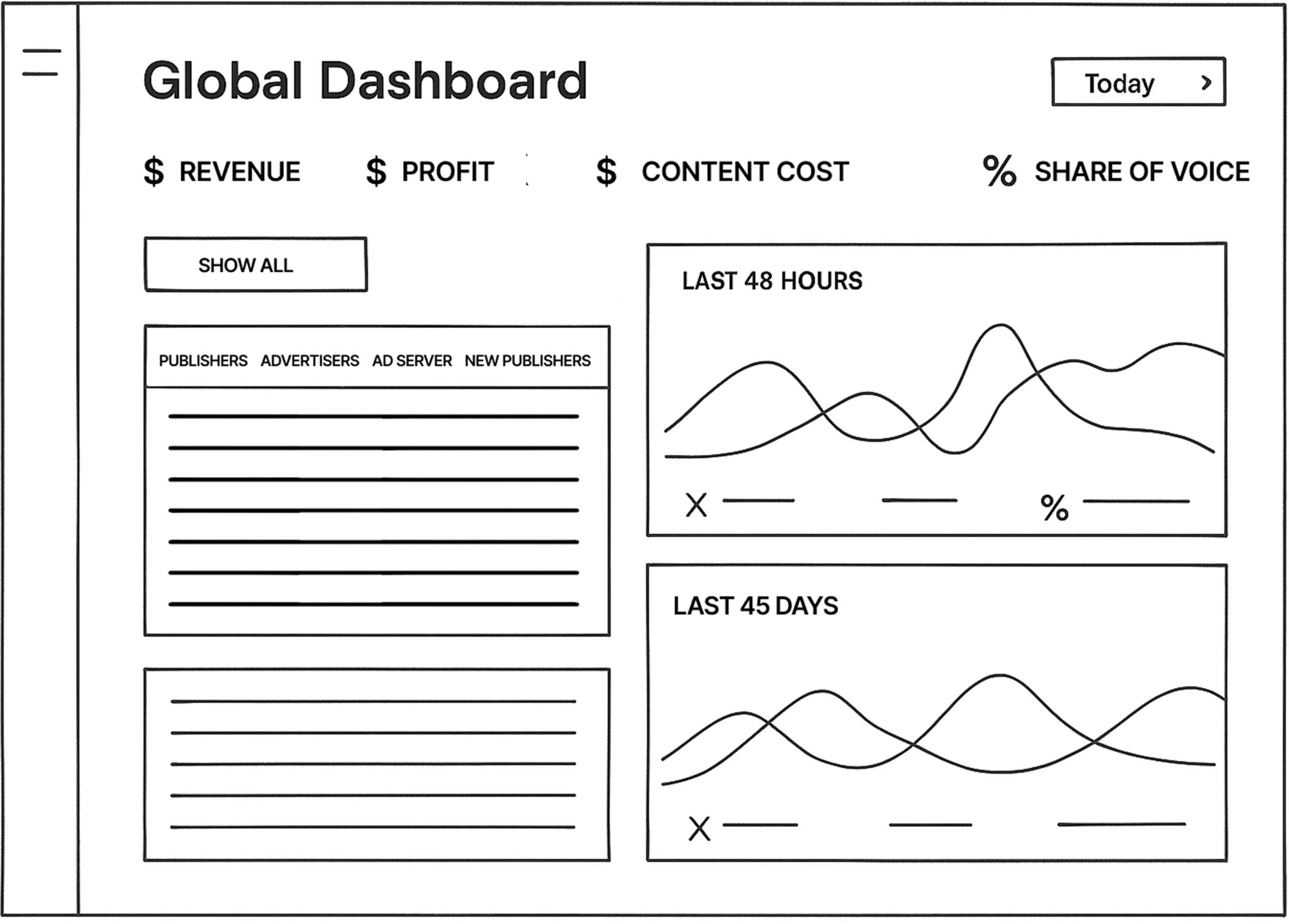
Final Dashboard
Publisher Dashboard – Vision, Ideation & Creation
Research
1) Persona‑Driven Discovery
Conducted 1:1 interviews with Primis clients (publishers, syndicators, hybrid roles).
Captured detailed needs for each persona: what questions they ask daily, what actions they take, and how they interpret data.
I consolidated 4 persona needs:
Publisher: trend lines for revenue and content performance, alert signals for declining metrics, ability to bookmark reports.
Advertiser: pacing controls, spend efficiency over time, placement quality metrics.
Syndicator: comparative analysis across channels, syndicated revenue share, partner contribution variance.
Publisher-Syndicator (Hybrid Role): For publishers that also perform as Syndicators of their own inventory.
2) Task & Context Mapping
Provided prototype dashboards with real anonymized datasets and asked users to complete critical tasks (e.g., find revenue of the last quarter, show/hide data).
Measured time on task, accuracy, and confusion points.
3) Competitive Benchmark & Best Practices Audit
Mapped how top BI and analytics dashboards (Looker, Tableau embeds, PubMatic, Magnite, etc.) structure publisher‑centric data, highlighting best practices in KPI grouping and layout.
4) Role Variation Framework
Defined a role adaptation matrix mapping which widgets, comparisons, and filters each role needs.
Recorded exceptions where data overlaps roles (e.g., a hybrid who needs both publisher breakdowns and syndication data).
Core Insights
Publishers care about directionality (is performance improving consistently?) more than raw numbers. Trends with annotations (change %, signal flags) are more actionable than static KPIs.
Role noise kills clarity: dashboards must collapse unused panels but still allow optional expansion.
What this research informed
Dashboard auto‑configuration per role with dynamic visibility rules for widgets.
Built‑in mentoring hints and tooltips explaining metric definitions.
Visual design patterns that scale from top‑line trends to specific breakdowns without clutter.
Research Summary
Method (interviews, observation, benchmarks)
Participants: Admins/A. Managers, Publishers, Syndicators, Hybrid Roles
Key metrics or patterns discovered
Admins/A. Managers seek an overall granulated view, while publishers seek performance insights
Actionable Insight
Users lacked trend context before filtering
Time selectors were ignored because they were not clear enough
Publishers wanted narrative comparisons (yesterday vs last month) more than static numbers
Solution
To support these variations, the dashboard automatically adapts its data modules, table structures, and KPIs based on the logged-in role. In practice, this means that certain widgets and data blocks appear only when they are relevant to that specific user type. For example, advertisers will not see syndication metrics, and syndicators will not see publisher-only content breakdowns. To keep the interface flexible without overwhelming users, each dashboard section’s controls are displayed/hidden according to the logged-in persona. The result is a single dashboard framework that stays consistent across the platform while still accounting for the functional differences between publisher, advertiser, syndicator, and hybrid roles.
Ideation Wire-Frame
Final Dashboard